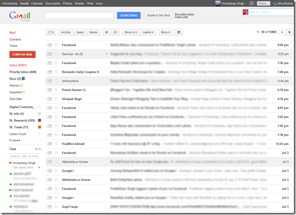
 The last few days have been really hectic for all those obsessed with Google with the launch of its new social networking Project – Google Plus and a series of improvements in terms of the user interface to all its products. The launch of Google+ has also inspired a lot of changes in the main Google Search Interface (red and white theme with black top bar) which you would have noticed by now.If you have got your hands on to the new social networking site, Google+ and you have liked the appearance, you would like to apply it for your Gmail Inbox as well. Below, I have listed a simple way of doing it. However, if you haven’t been able to use Google+ because of the limited access right now, you would like to read my previous article on the first impression I had after using Google+ as I have been lucky enough to use it.
To activate the new theme, click the Gear icon button in the top right corner of Gmail and go to Mail Settings. Then, click the Themes tab and look at the bottom to find “Preview (dense)” and “Preview,” – the two new themes. These are the 2 new Gmail themes that resemble the Google+ interface. Check which one of the 2 fits your screen resolution and you are done.
Once you make the changes, here is how your redesigned Gmail inbox is supposed to look like:
As quoted on the Gmail blog,
We’re embarking on a series of interface updates to help strip out unnecessary clutter and make Gmail as beautiful as it is powerful. This is part of a Google-wide effort to bring you an experience that’s more focused, elastic, and effortless across all of our products. The changes are not going to happen all at once.
So, stay tuned for more changes in the coming days in the entire Google’s estate of applications. For now, have fun using Google+ and if you do not have the access to Google+ right now, have a feel of its clean and much praised user interface in you Gmail Inbox. Feel free to share your feedback in the comments section below.


0 comments:
Post a Comment